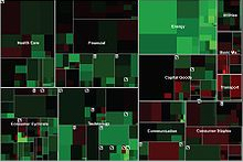
A powerful way to show the relative importance of amounts is to use a treemap. A treemap is a hierarchical (tree-structured) display of data as a set of nested rectangles. Each data element is represented by a rectangle that is proportional in area to the size/amount of the data element. Individual elements can be subdivided in further sub-branches.
This way of visualizing amounts is used effectively by David McCandles. His website Information is beautiful is full of great examples of visualization. I would also recommend his Ted.com video on the beauty of data visualization.
To create a treemap yourself this Microsoft Excel plugin can be used.